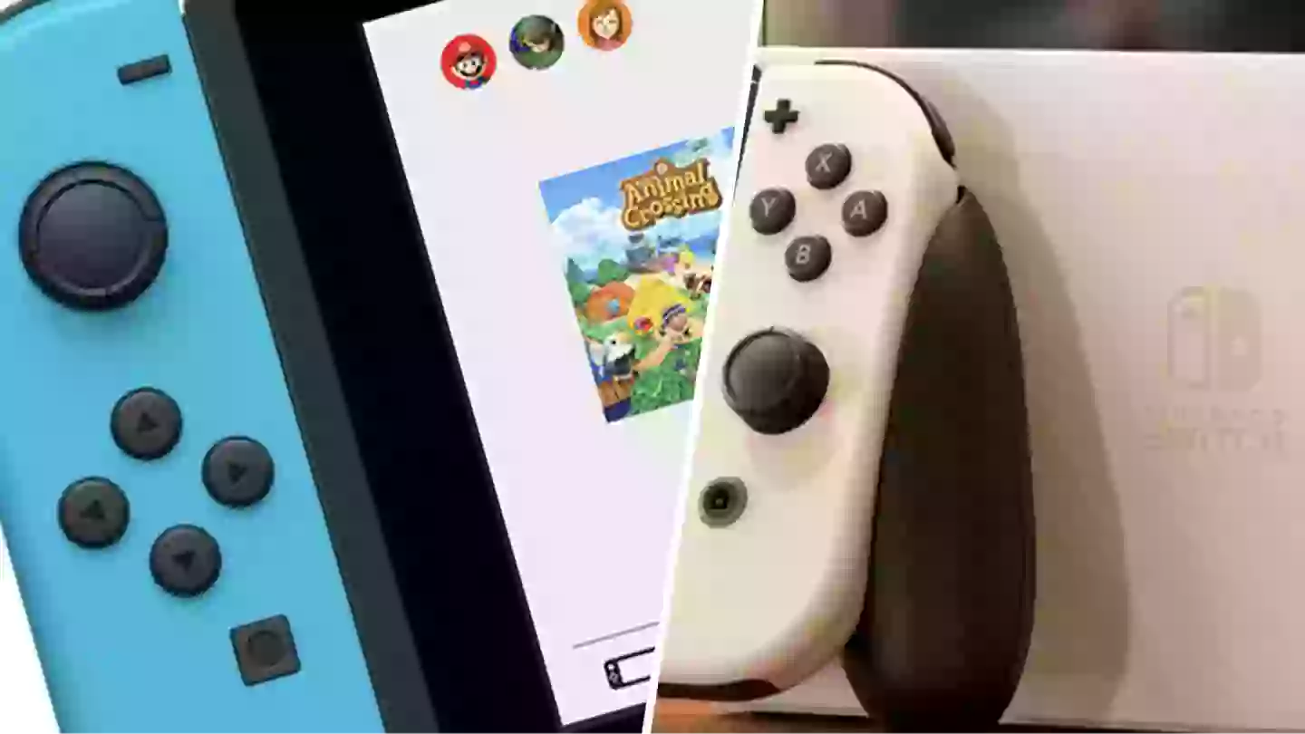
A design for the Nintendo Switch 2 has leaked, and fans don’t seem all that impressed.
It’s no surprise, the leaks that appeared on Reddit, shows very few changes between this anticipated console and the Switch OLED model.
Nintendo Switch Online brings a wealth of classics to the Nintendo Switch
From the looks of this, I hope it’s an old concept, as it looks like nothing has really changed since the OLED Switch.
Advert
While many could argue the Nintendo Switch design is great and needs no major changes, one Redditor points out some major issues with Nintendo’s handheld.
“Switch ergonomics, USB placement [...] are bad,” said Ragnarok992.
I have to agree. As much as I love my OLED Switch, it’s not the most comfortable on the hands due to its thin profile.
Kevinatorz thinks, “It's a bit boring.”
Advert
I can see this being just a shell without any ergonomic pieces situated which seems to be the consensus on Reddit.
“It would make sense if the prototype started out with the most current switch design, and then aesthetic changes were made after the architecture was finalized,” says the top reply on the thread.
Another user points out, “More recent renders show a more handle-style kickstand, a non-USB-C bottom port, and a more unique top part of the shell in terms of buttons and port variety.”
I’d be surprised if Nintendo stuck so closely to what they’ve released before.
Advert
It would also be a shock if the new Switch wasn’t much thicker than the old console, simply due to an increased battery size which will be needed for the better visuals we assume we’ll see.
DrZoidburger89 says, “They have to make it unique enough to stand on it's own feet in the public eye, I think they learned their lesson with the marketing for the WII U.”
Let’s hope so because this feels very lacklustre at the moment.
Topics: Nintendo, Nintendo Switch
