The original Xbox dashboard UI is peak design, fans agree
Topics: Xbox, Xbox Series X, Xbox Series S, Xbox One
Topics: Xbox, Xbox Series X, Xbox Series S, Xbox One
Fans are calling for more aesthetic UI options on their home consoles, saying the original Xbox dashboard was the peak design format.
When you look at the home screens for the Xbox Series X/S, PS5 and Nintendo Switch, there are a few similarities. They’re very sleek, organised, and refined, mainly to promote easy navigation through the menus to find what you’re looking for in the least amount of time.
Sure, it’s appreciated, and it’s nice to have everything organised so you’re not taking ages scrolling through stuff to find what you want to look at or play, but you can’t deny the UI of older systems had way more charm to them.
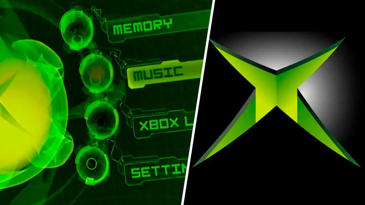
That was made abundantly clear by Twitter user Cybershell, who shared a retweet of the UI from the original Xbox, which just looks so much better than what Xbox, and other console users, have to look at nowadays.
The old Xbox UI utilised the glowing, almost radioactive, green that became the base colour in the company’s logo, with all the menus looking bold and futuristic. The current Xbox UI features none of this anymore, opting for a blocky, uniform Windows look, which isn’t a bad design, just not as good.
Advert
Commenters expressed disappointment in Xbox, PlayStation and Nintendo for moving away from more characteristic UI backgrounds, and how much they’d like them to return in the future.
“it’s an insult that there’s a switch menu for themes but there’s only light and dark mode after all these years”
“It pains me to think how lame current Xbox’s dashboards be looking like”
“6th Gen consoles had menus that were just vaguely ominous and eery in a way that I dearly miss.”
Admittedly, it was the peak of UI design, although the PlayStation 2 and GameCube UIs were just as cool, and had just as much personality in their design.
Surprisingly, out of all the current-gen consoles it’s only Xbox that offers any form of customisation to the home screen, albeit in a limited fashion. You can change the background image from static colours, to artwork, to dynamic backgrounds that shift and move. You can also change the primary colour of menu icons.