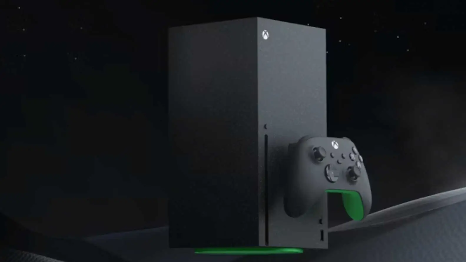
Xbox Free UI Overhaul Finally Coming But You Won't Like It
Topics: Xbox, Xbox Series X, Xbox Series S, Microsoft
Topics: Xbox, Xbox Series X, Xbox Series S, Microsoft
Xbox is once again changing the way its console UI looks but it’s a far cry from what the fans were hoping for.
It’s probably not a hot take to say video game consoles have gotten dreadfully boring with every new release.
Consoles back in the day had personality. The OG Xbox was a bulky beast but it looked fun, and the Nintendo Wii’s slim and small frame made it fit just about anywhere when you were setting up.
New consoles lack the spice they once had and there’s no better example of that than console UI.
The Xbox Dashboard has felt like a second home to many gamers out there, so it’s a shame it’s gone down the same road most companies have gone with its design.
Advert
Nowadays, it’s all about the minimalist approach and when you compare the current UI for the Xbox Series X/S to the dashboard of the Xbox 360, the difference is night and day.
Idle Sloth did a breakdown on X of Xbox’s new UI overhaul coming later this year, and while it looks sleek it fails to improve upon what we’ve had already.
Analysing what’s believed to be a new UI tease spotted by The Verge, Idle Sloth’s post said: “Here are a few minor differences on the homescreen:
• Profile in the top right corner
• Centre icons have been rearranged
• Added a home icon (Centre icons)
• Removed the settings icon (Centre icons)
• Three ad slots along the bottom
• Instead of dedicated 'Browser the Store' slot and three ad slots to the right of it.”
Images of the new dashboard definitely look different but not better, which was a sentiment shared by Xbox.
One comment read: “I really hope not. They moved the tiles down a couple of years ago so we can see the wallpaper but they're right back up in this 'new' one”
Another added: “Is the ‘new’ in the room with us right now? Looks like the same minimalist b******* we’ve had since the Xbox One. Give us an actual new dashboard.”
Clearly, nobody is a fan of the changes but many are arguing that it’s unreflective of the finished product.
Now that may be the case but it still doesn’t mean the new UI is going to be an improvement as again, there’s just no spice in them anymore.
The PlayStation 5 is just as guilty of this as the Xbox Series X/S and it’s best not to even get started on the Nintendo Switch/Nintendo Switch 2.
There’s a distinct lack of identity in these modern console dashboard designs and it’s made worse by the lack of customisation, preventing users from creating their own backgrounds that are visible at all times.
Since joining Xbox, the new CEO Asha Sharma has made some excellent changes to the company and has repeatedly said they’re listening to player feedback. Hopefully, with a unified voice, Xbox owners can bring the sauce back to their platform.
READ MORE: Xbox Users Livid Must-Have Console Feature Is Locked Behind An App