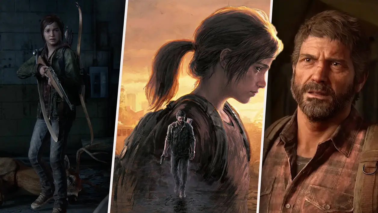
The day is finally here. The Last of Us Part I has officially been released into the world and I’m sure most of you reading this will already have your hands on a copy. If you haven’t, you may be intrigued to know that the game’s received rave reviews. In our own review, I wrote that “fans will find no better way to experience this story, and first-time players are likely to discover a new all-time favourite,” rating the game a stellar nine.
I had the chance to sit down with game director Matthew Gallant and creative director Shaun Escayg to discuss all things The Last of Us Part I which, as a massive fan of the franchise, was an incredibly special thing to do. During the chat, the duo revealed exactly how the Pittsburgh hotel basement fight is even scarier this time around, plus why adding prone and dodge wouldn’t have suited Part I. If you’ve already checked those snippets out, get comfy because you can read the full in-depth interview below.
Yet to dive into the game? Check out the epic launch trailer.
Advert
Congratulations on the game. When you’re tasked with making a remake, especially of a game as beloved as The Last of Us, how do you go about finding a starting point? What were you initially looking to improve?
Escayg: It's a lot of pressure creating a remake of arguably one of the greatest games ever made, so we initially set some pretty strict goals for ourselves. We knew that we wanted new fans and our existing fans to have the ability to play Part I and Part II contiguously without these large gaps in technology or visual fidelity. We also knew that it was important to expand our accessibility features so that more of our fans could enjoy this game. But ultimately, we wanted to stay faithful to the core experience - preserving everything we love of the original game, but using all our knowledge over the last decade to build upon and enhance every aspect of the original.
Gallant: There were all sorts of places when we were making the original game where we were very constrained by the technology available at the time. We had very hard limits on memory and processing power and really, the original creative vision of the game was quite a bit larger than what we were actually able to execute on the PlayStation 3. There were limits on how much foliage we could have, or how much detail there was on a character model. In some of the original fights, we had to say, well, we can only have male Runners in this fight, because we can’t have male and female Runners loaded at the same time.
So right off the bat, getting a chance to look at some of those decisions that were made purely from a tech-constrained perspective, that opened up a lot of creativity and possibility. [...] To give an example, there are parts of the original game that aren't that detailed. [...] Now we have the memory. We have the capacity to revisit those spaces. To me, the prototypical example of this is the State House Museum in Boston. There's these back offices that in the original game, were just kind of generic - they really weren't that detailed. Now, revisiting this game on the PlayStation 5, we got to go back and say, ‘What would you have in the back offices of the museum?’ Now, there's art restoration stations, there's colonial busts kept in storage - you can see the tools that they were using. We got to really go in and add all that richness and detail and texture.
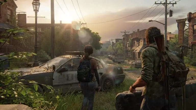
One of my favourite things about Part I’s environments is that they really build on and advance the mood and atmosphere. I felt that a lot more strongly in the remake. Was that a driving force behind the redesigns?
Escayg: Oh, absolutely. We had to overhaul every aspect of the game. All of this sort of amalgamates into heightening this experience. A good example I often quote is the quarantine zone. You're literally transported there - and this was a particular area that was previously restricted by tech. Now it feels stifling, lived in, dangerous - there's just layers of life and activity. Or when you're outside, to juxtapose that, there’s bugs, stirring in the bushes, moss swirls around your legs as you wade into the water.
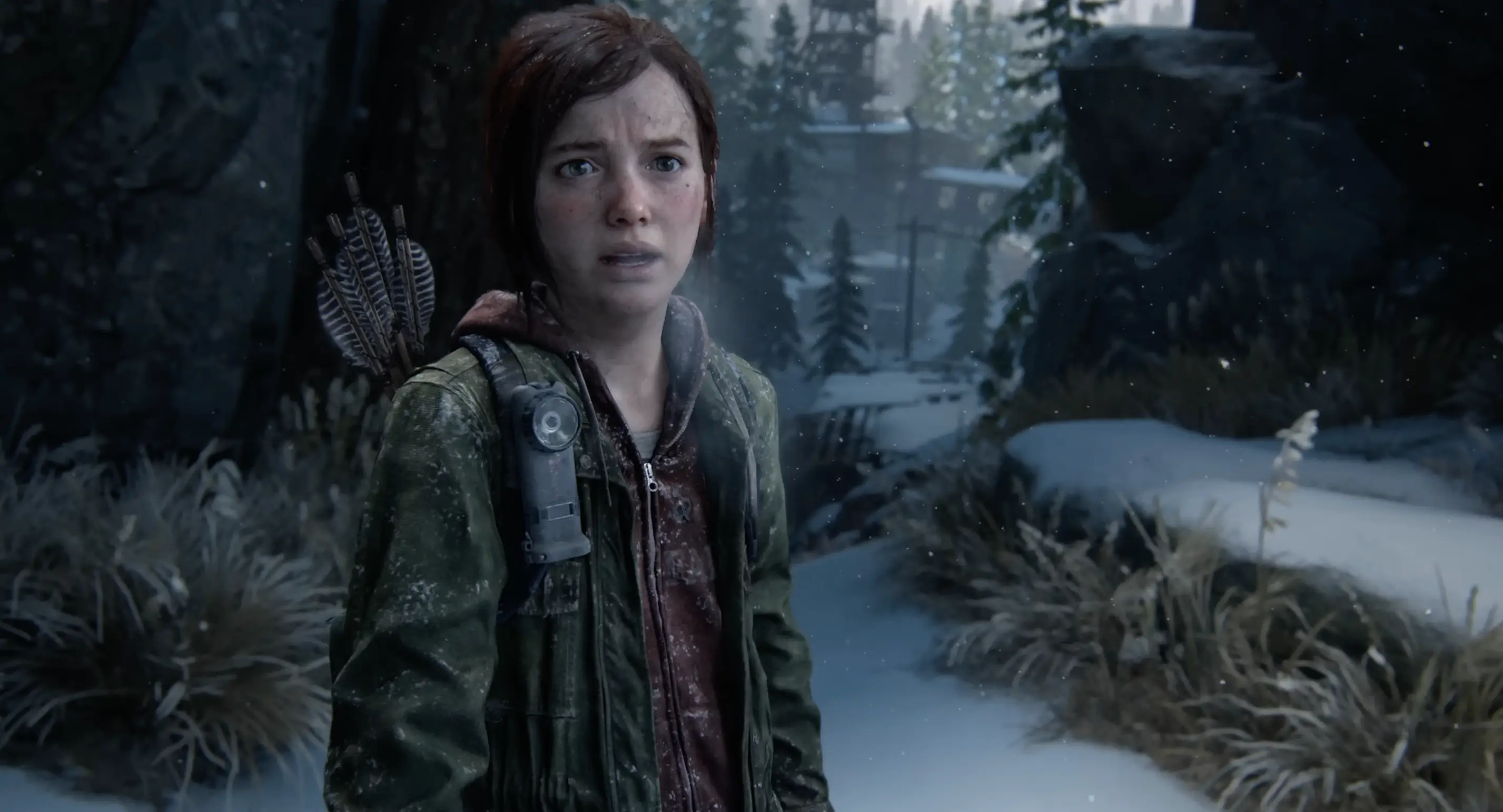
We particularly rebuilt all our characters to be more realistic and more expressive with detail down to things like the iris and sunspots on their faces. One particular example of where I think you can really appreciate the environment, characters and animation coming together is that scene where Ellie and Joel are arguing at Tommy's. You can literally see Ellie's eyes flutter and well up. Her face goes flush at the same time as it dawns on her that, you know, Joel is about to abandon her. And then when Joel gets angry, he barks at her and spit sprays out of his mouth. These are scenes that we've seen over and over again, but we still can't help but just be glued to the moment.
I'm impressed by the nuanced moments like Ellie and Riley dancing on the display unit in the mall. Our art directors [Erick Pangilinan and Sebastian Fromann] did a really great job at subduing the background, and then the spotlight is just on one of these two characters. In that moment, you can see Ellie stop and process, ‘I'm gonna lose the love of my life to The Fireflies.’ There’s no words spoken. That’s where you really appreciate how far we’ve pushed the emotional depths of the story.
I definitely felt that nuance as the player. I particularly thought adding the red flares to the ‘University’ section built a ton of tension. You’ve touched on some but were any environments a real treat to reimagine?
Escayg: University was one of the more difficult and one of the most rewarding areas to see. There is a complete visual shift when you enter the dorm area. That’s one of my favourite areas in the game. You can see the light streaming in, highlighting all the Infected growth on the walls. There are these pockets of light and it just gives an almost claustrophobic feeling, but there’s a sense that I can get out of it, you know. You’re emotionally encouraged, just by the lighting, to escape this space. [...] I love to see spaces like that where I know we’ve added that claustrophobic feeling.
Gallant: One of the key ingredients of The Last of Us is the beauty of the natural world. Part I is noticeably more lush and vibrant. That was hard in the original because foliage is quite expensive to run in a game engine. There's lots of detail that's very difficult to render and we were very limited again on what we could do on the PlayStation 3, and then subsequently on the PlayStation 4 remaster. In this remake, the artists are unconstrained. They can go into these spaces and just really shape these beautiful leaves and vines coming up through the cracks. If I'm playing the beginning of Bill's town, it's such a lush, beautiful space. It just makes me want to stop and pause and look at the way the artists found ways to have nature reclaiming the old world. Every level that has that aspect.
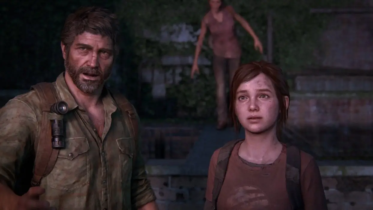
Speaking of such exquisite attention to detail, fans are already poring over every frame and I get the idea that they’re going to be finding fun, new details for a very long time. Are there any you want to point us in the direction of?
Gallant: On the gameplay side, we have these optional conversations between Ellie and Joel. The kind of systemic technology we have now allows us to add emotion or conversational gestures on each line. That’s so much more detailed in this game. If you go up and talk to Ellie, she’ll be joking on one line but then kind of grumpy on the next. It’s similar to the buddy AI system and how characters can change the way they explore an environment. It’s never something that's really going to draw your eye, but it's always there in the background. In this grounded realistic world, we want Ellie to feel like a real person so in every situation, she's reacting to you or looking over or checking under something in a way that just feels so human, it feels so real. It's very easy to just not focus on the attention to detail and I hope people don't. I hope they just get lost in the experience and that it just feels real.
Escayg: I think Matthew is so right. The goal here is that you don't pay attention to anything, you're just so drawn into this world, that you're just experiencing it - or almost reliving it if you're an existing fan. [...] For me, there’s a moment where Joel and Sarah are having a conversation in the opening sequence. They're on the couch and the way the sofa reacts to her movement, the way she interacts with her dad, or the way he interacts with her when she gives him the watch - you really start to appreciate the layers of emotion that Joel gives off. When he receives that watch, you see that subtle switch like, ‘She remembered my birthday. She bought me this watch.’ It feels effortless, but it's so much nuanced work that the team has put into those scenes. I've seen it hundreds of times and every time I see it, I see something new.
Also, one of my favourite spaces for detail is the Financial Plaza. It’s so much more intense. Things break and move and flex. The world feels more alive in ways that it wasn't in the original. Bookshelves collapse from impact, splinters shatter, vehicles flex under the barrage of bullets - so it makes everything feel just super amped up. We spent a lot of time trying to boost these little pockets of combat so that they feel so visceral.
I’m curious, are you ever restricted when you’re making a remake? Were there ever changes you wanted to make but you couldn’t just because of how beloved the game is?
Escayg: It depends on if you see it as a restriction. For The Last of Us Part I, we set our restrictions ourselves. It wasn't like we were told what we can and can’t do. We just knew there was a great responsibility to the original creators. We were part of that team too. We love this franchise dearly and are committed to our fans. Just because we have technology, it doesn't mean we add it into the game. [...] We're very careful to preserve the integrity of the original and the essence of the core experience - making sure that we honour that. I think we feel very strongly that this stuff holds up really, really well so our vision was to take everything we loved about the original and build on it, enhance it - bring it up to 2022 in terms of visual fidelity and technology, but retain the core and the essence of the game.
Gallant: It also comes down to the art direction. When you're on the PlayStation 5, you can fill the screen with stuff. You can go wild with what you put in, but that's not what next-gen aesthetic means. It can sometimes mean pulling things back. It can mean clarifying, simplifying, it can mean shaping. I don't see it as restrictions or creative constraints. We’re just being very intentional with our choices, rather than just being maximalist. It’s a beloved well-rounded experience. Nothing that we put in should take away from it or distract from it. That meant making very deliberate creative choices.
As a fan of The Last of Us, I’m very familiar with the layout and progression. I wondered if I’d stumble across any small additions in Part I, such as extra rooms or collectibles but that’s not something I found. Were you ever tempted to add in those sort of nods to seasoned fans?
Gallant: The way I see it is that there aren't any new collectibles telling you some backstory about the space but we got to go in and reassess the concept. There's new environmental storytelling. You can see traces of the old world, the pre-apocalypse, plus the newer world. The world that’s full of smugglers and Fireflies. What would’ve been unremarkable little corners of the original game now have that level of storytelling in the art. Hopefully now when you're moving through these spaces, every space is telling a story and enhancing your exploration in that respect.
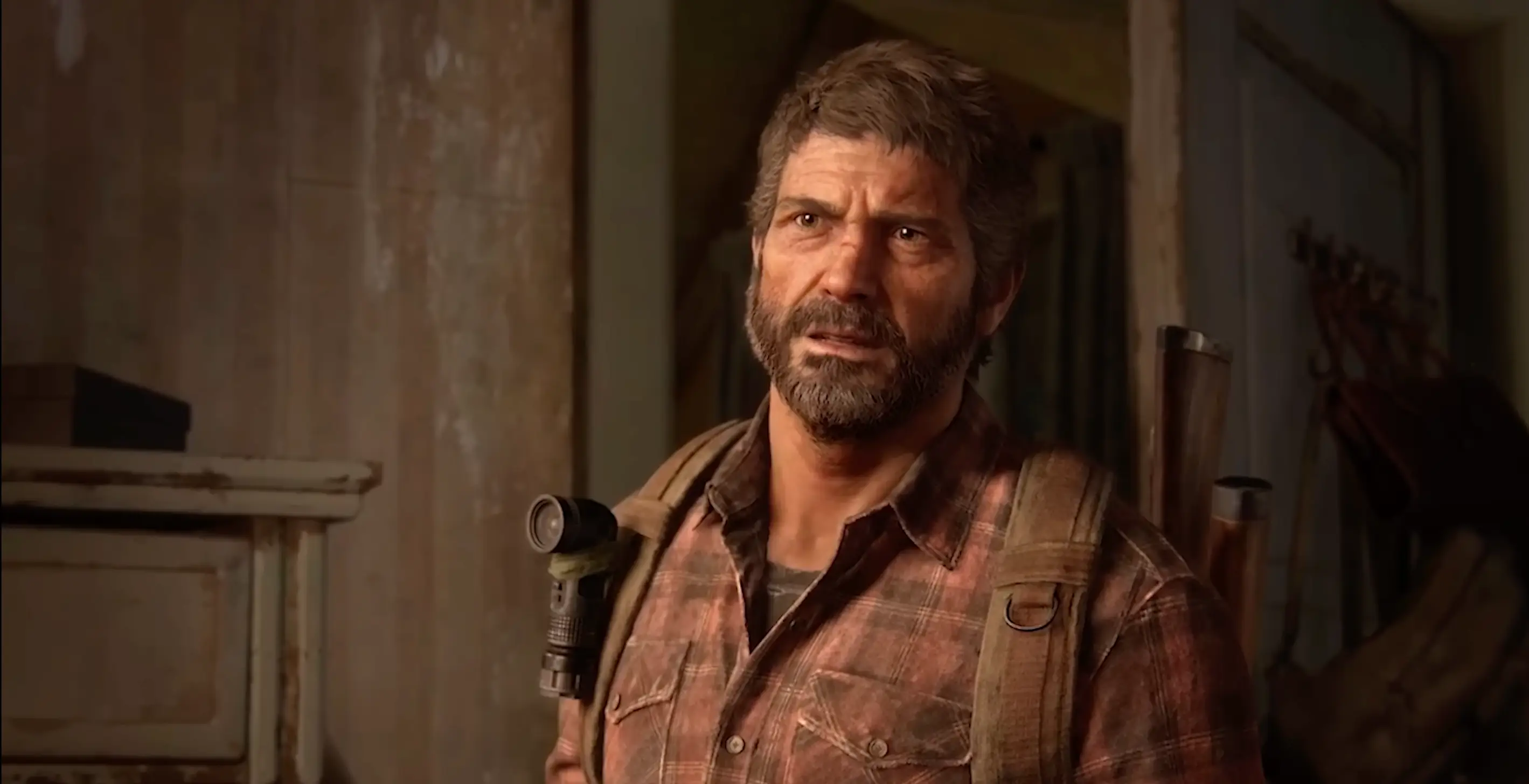
Yeah, that’s definitely something you sense straight away in the prologue. I spent a good chunk of time taking in every detail of Joel’s house, hoping to learn something new about the character. How do you cater to two very different sets of expectations? Because you've got new players plus returning fans.
Escayg: This remake is our love letter to the franchise, to our fans, and to ourselves as developers. It was everything that we wanted for the original. Again, you know, it’s also one of the greatest games ever made so there is a sort of holy grail approach to remaking this game. We're carefully crafting - realising areas, but not changing the core experience of these spaces. Spaces are now better realised. They're expanded upon. This story, this journey of Ellie and Joel, is so iconic. New players have the ability to play Part I and Part II contiguously in a way that explores this complete emotional arc. We love these characters, and want more people to be able to come into this story seamlessly and just enjoy it to the fullest.
Gallant: I think both returning players and new players, to some extent, will want the same thing. They want to have an incredible journey. They want to be transported by these characters. They want to have their heartstrings pulled on and just experience an incredible story delivered in a way that only video games can - and the way that this game does. I hope returning fans will find new layers of complexity, but that both new fans and returning fans will find just an incredible story and fall in love with these characters the way that we have.
One final question. Ellie can wear a bunch of fun PlayStation shirts in Part I. We know she’s very much in love with the idea of playing video games. What games do you think she’d be a fan of?
Gallant: It's a good question. She really gets into Angel Knives, you know, the fictional fighting game. I wonder if there's some alignment there. Maybe God of War?
I can see her enjoying Horizon Zero Dawn.
Escayg: Yeah, and maybe she’d be into Sifu? To fit with the fighting theme. That would be her game.
The Last of Us Part I is out now on PlayStation 5.
Topics: Interview, The Last Of Us, Naughty Dog, PlayStation