Woah there, that’s a bit of a bold headline, isn’t it? And of course it’s coming from the die-hard Nintendo fan who didn’t think Pokémon Sword and Shield’s trees were the end of the world. The audacity. Before you go scrolling away in anger though, listen, hear me out, because I swear this actually makes sense.
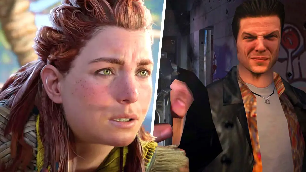
Picture this - the year is 2001. It’s early on a Sunday morning, and you’re sat there on your PS2, playing Max Payne (which is officially getting remade now, by the way). Isn’t it wild just how much his face looks like an actual, real person? How impressive. Video games have never looked better than this.
Take a look at the original trailer for Max Payne below... yeah, it hasn't aged very well.
Advert
However, even a mere year from then, Max Payne was certainly not the pinnacle of realistic graphics. As character models improved (and they did, rapidly), it became increasingly more apparent that poor Mr. Payne was just a pile of polygons with a real man’s face plastered over the top of them. Which, to be fair, at the time was pretty ingenious, but looking at it now, it’s funny to think that there was ever a time when it could even remotely be considered as such. Alas, this is the curse of any game that dares to dream to replicate reality.
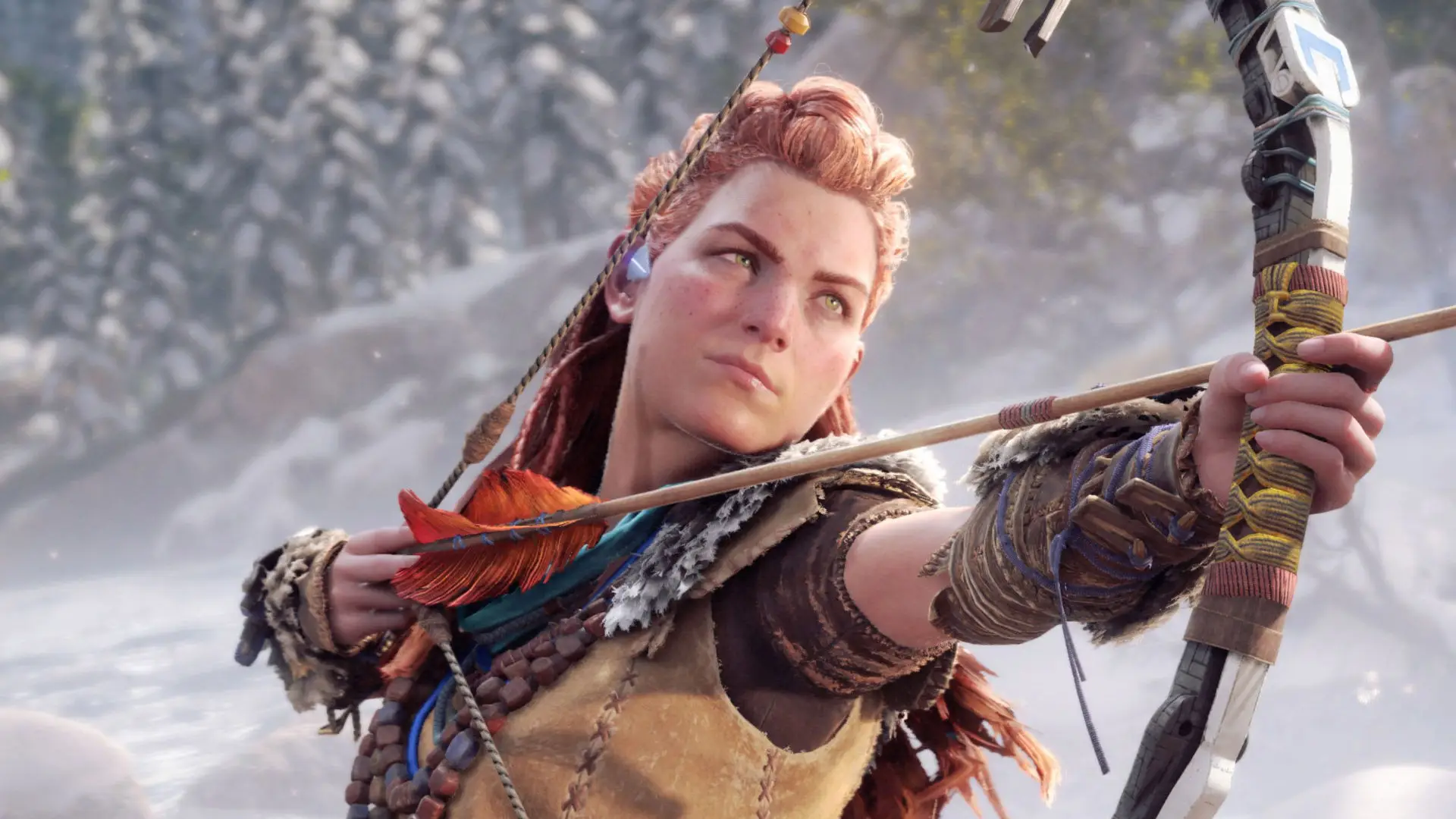
The thing is, technology is always evolving. It’s kind of the point. What’s shiny and new now is never, ever going to remain shiny and new forever, no matter how good it is. It’s only going to make it seem not out of date for a bit longer. When you look at the likes of Horizon Forbidden West, with the incredible detail on Aloy’s face (which some people, hilariously, hate), it’s difficult to imagine a time when that’s not going to be considered spectacular. But no, everything has an expiry date. When we’re inevitably playing everything in 16K and 240FPS, even the best offerings on the market right now are going to look dated.

However, there’s quite a simple solution to this debacle, and a lot of devs have been doing it from the start. Quite simply, you’ll never have a crappy looking realistic game if you don’t try to make it realistic in the first place. Can’t be beaten by the system if you were never in it from the start.
Seriously though, think about it. There’s a reason why the likes of Ōkami and The Legend of Zelda: Wind Waker have aged as well as they have - their distinct art styles are timeless. In the case of Wind Waker, it’s quite ironic when you consider how many Zelda fans at the time were very critical of the game’s visual choices, as it went for something a lot more colourful and certainly less serious-looking than the series’ most recent 3D entry at the time, Majora’s Mask. However, remakes aside, it’s very clear which game visually stood the test of time more successfully.
Not only that, but it’s seriously not talked about enough how much a unique art style can elevate a game’s identity and cement it as a far more recognisable title. Take The World Ends With You, for example (which by the way, if you’re reading this and haven’t played it and its sequel, do). Even though the first game became a bit of a cult classic over the years, as one of the lesser known gems of the Nintendo DS, it’s by no means a mainstream title. Despite that, I can guarantee that the vast majority of gamers will recognise that funky, heavily outlined art style from somewhere on the internet, be that from a screenshot or some YouTube commenter’s profile picture (Neku and Joshua stans are everywhere).

At the risk of sounding ridiculous, you can also say the same thing about Minecraft, not that that one is a niche game by any stretch of the imagination. The graphics have never been the selling point of the blocky building game - even with each console upgrade, it only really means that the colours are a bit brighter and the lighting is a bit nicer. It’s always been blocks, and it always will be. But it’s certainly never looked bad, either, and more importantly, it’s one of the most recognisable games of all time. You can’t tell me that Minecraft would have had the same cultural impact if it didn’t look so distinctive - you can show a kid a cube and their mind just immediately goes to the game. Not that people tend to go round showing children cubes very often, but you get what I’m saying.
So, what are we meant to do then, reject all realistic graphics and embrace the voxel and cell shaded styles forever? No, obviously not, that’d be absurd. But I do think that as a result of tech allowing games to look so much better than they ever have, more and more devs, particularly those working for major publishers, are pushing for those photorealistic visuals simply because they can (and, more and more these days, because they’re expected to), and for all the reasons we’ve just talked about, that’s not necessarily a good thing.
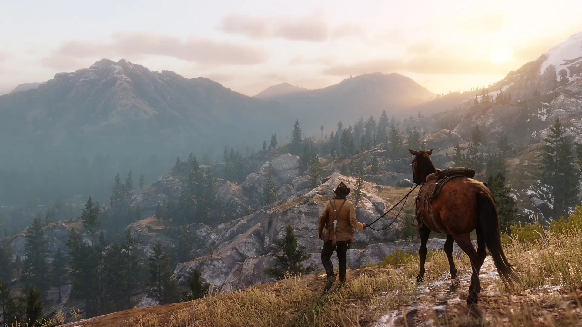
Let’s face it, getting a game to look really good is a flex. Like, a huge flex. Take Forza Horizon 5, Red Dead Redemption 2, and the aforementioned Forbidden West - they’re all examples of games that just know that they’re hot stuff. And while we might all like to say that console wars aren’t a thing anymore, you can’t deny that some people will always be ready to compare exclusives from Sony, Microsoft and Nintendo, throw them under the metaphorical microscope, and god forbid any of them dare have less polygons than the other, or there’ll be hell to pay.

It doesn’t take a rocket scientist to figure out why it’s usually the indie titles that dare to be more innovative with their visuals - the level of scrutiny they face just isn’t the same. People tend to celebrate indies as exactly what they are - (often) great games in their own right, with no strings attached. With any new AAA game though, the approach is different - they’re expected to be flawless, and blow all possible competition out of the water. And to the casual onlooker, what’s the easiest way of comparing one game to another? How it looks. It’s no wonder that major studios are seemingly always pushing for the very best visuals they can achieve, but is it really worth it?
Regardless of the potential of having a massive slew of slightly gross looking games from this generation in a decade’s time, we’re running the risk of games losing what could be a key part of their identity, and also just not having a nice variety of visuals to look at. I’m personally a massive fan in the surge of popularity of HD-2D games, such as Triangle Strategy and the upcoming Dragon Quest 3 remake - you’ve got all the fun of modern day enhancements like juicy frame rates and glossy lighting, but with the sheer joy of looking at something a little bit different to everything else on the market.
All I’m saying is, I think it’s important that we maintain a bit of balance. Devs definitely shouldn’t stop striving for the best in realistic graphics - they’re works of art in their own right - but without a bit of variety, things get stale. And I don’t know about you, but I’m personally way more impressed by a game that dares to venture out of the box (and does it well, of course) than one that allows me to zoom in and count all the individual pores on each character’s face.
Topics: Opinion, PlayStation, Xbox, Nintendo